Max_B
Member
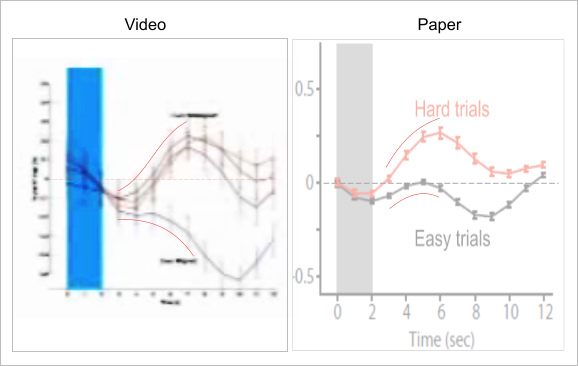
I watched part of a presentation on Youtube of Graziano's ideas (below). In the video at 8:07 he shows a graph which I find interesting. You'll need to watch from the start of the video to understand this experiment though.
In the graph on the video I can see the top three fMRI plots of aggregated trials, which show qualitative changes in blood oxygenation on the misaligned, 'hard' tasks. Graziano says this implies increased activity for hard tasks.
The interesting point for me is the bottom line, which shows the plot of aggregated trials on the aligned, 'easy' tasks. This too shows qualitative changes in blood oxygenation. Graziano says this implies decreased activity for 'easy' tasks, compared to the 'hard' tasks. OK... but why does the plot fall way way below the baseline? My assumption would be that Gaziano should interpret these results as indicating a reduction in activity for the 'easy' task compared to normal activity, not just a reduction compared to 'hard' tasks?
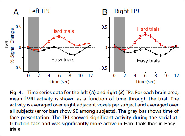
You can look at his actual paper here (which I've not read). The same data in the graph on the video is shown at Fig.4 in the paper, I've copied this below. I'm not quite sure why the graph Graziano shows in the video looks somewhat different from the graphs shown in his actual paper? However, I can still see the same general changes, so I'll leave that alone.
What seems clear is the aligned 'Easy' task trials seem to show a reduction in the fMRI signal, compared to baseline 'normal' activity.
Bear in mind that fMRI only shows qualitative changes, that is comparisons between one time period, compared to another. What the actual existing level of activity was before the trials is unknown, but the 'Easy' trial measurement indicate that normal baseline activity was somewhat higher, otherwise we would not have seen any reduction.
I have some issues with fMRI studies anyway, as to just what they are showing us. I'm also not convinced by Graziano's attempt to explain this reduction in his video presentation, I think it's strange, and probably significant.
In the graph on the video I can see the top three fMRI plots of aggregated trials, which show qualitative changes in blood oxygenation on the misaligned, 'hard' tasks. Graziano says this implies increased activity for hard tasks.
The interesting point for me is the bottom line, which shows the plot of aggregated trials on the aligned, 'easy' tasks. This too shows qualitative changes in blood oxygenation. Graziano says this implies decreased activity for 'easy' tasks, compared to the 'hard' tasks. OK... but why does the plot fall way way below the baseline? My assumption would be that Gaziano should interpret these results as indicating a reduction in activity for the 'easy' task compared to normal activity, not just a reduction compared to 'hard' tasks?
You can look at his actual paper here (which I've not read). The same data in the graph on the video is shown at Fig.4 in the paper, I've copied this below. I'm not quite sure why the graph Graziano shows in the video looks somewhat different from the graphs shown in his actual paper? However, I can still see the same general changes, so I'll leave that alone.
What seems clear is the aligned 'Easy' task trials seem to show a reduction in the fMRI signal, compared to baseline 'normal' activity.
Bear in mind that fMRI only shows qualitative changes, that is comparisons between one time period, compared to another. What the actual existing level of activity was before the trials is unknown, but the 'Easy' trial measurement indicate that normal baseline activity was somewhat higher, otherwise we would not have seen any reduction.
I have some issues with fMRI studies anyway, as to just what they are showing us. I'm also not convinced by Graziano's attempt to explain this reduction in his video presentation, I think it's strange, and probably significant.
Last edited: